
Introduction - Tileable Textures - Easy Bump Mapping - Intermediate Bump Mapping
Advanced Bump Mapping
In this section I won't be providing a tutorial for you to follow, but instead I hope to encourage you to find your own ways of creating bump maps. The tutorials in the previous sections were merely a guide for you to become comfortable with making bump maps. They were the most appropriate way to bump map those textures, but you may have to use wildly different techniques when trying to achieve the best result for other textures.
The point is that there is no one correct way of doing things. I hope to show you through various examples how it is important to be aware of the capabilities of the The GIMP and to be able to use them in the manner most appropriate for the texture in hand.
Please Note:
The textures shown in the examples below are not the originals; they were rather large and had to be resized in order to preserve bandwidth. The in-game shots are taken using textures and bump maps that I created from the originals.
Simplicity
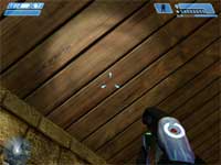
Sometimes all that is needed for an effective bump map is something incredibly basic. Look at the wood texture below and you can see that a flat shiny surface with a dip at the side of each plank is all that is necessary. The bump map was incredibly easy to create; a straight black line was drawn down the gaps between the planks and slightly blurred.
 |
 |
 |
| Wooden Planks Texture (click to enlarge) |
Bump Map (click to enlarge) |
Bump Mapped Texture In-Game (click to enlarge) |
Attention To Detail
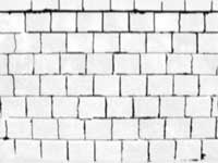
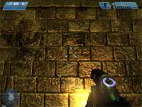
There are times when no amount of Brightness-Contrast adjustment will give you a worthwhile result and you simply have to go in and do it all manually. Check the wall texture below and see how some of the brick edges are not very distinct (especially the horizontal ones). This, coupled with the fact that some of the bricks had colouring that was darker than the gaps, meant that the only way to get satisfactory looking edges was to go in and paint around every brick as accurately as possible.
This took about an hour and a half to achieve, but sometimes it's necessary to go to these lengths in order get the best result.
 |
 |
 |
| Wall Texture (click to enlarge) |
Bump Map (click to enlarge) |
Bump Mapped Texture In-Game (click to enlarge) |
Ignore The Texture
All of the other techniques involve making use of the original texture to create the bump map, but you don't have to do this. You could use another texture as the base for a bump map. You could simply draw your own pattern. You could also use multiple techniques across many layers. It's really only limited by your imagination and creativity.
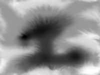
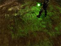
Note, however, that this won't really work on things like brick textures, where the eye expects to see light and shadow around the obvious areas. Therefore, it's best to use this technique on textures not containing specific objects, like the one below. Notice how the bump map has no relevance to the texture at all, yet still provides a nice, unique depth that doesn't look out of place.
 |
 |
 |
| Texture (click to enlarge) |
Bump Map (click to enlarge) |
Bump Mapped Texture In-Game (click to enlarge) |
Respect The Edges
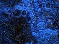
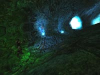
In the long pursuit of the the most amazingly detailed bump mapping possible, it can be easy to forget what really matters. Solid black has exactly the same effect as solid white. When the difference between them occurs, that is what matters. Sometimes the finer details are unimportant and focusing purely on the gray edges can yield better results more efficiently.
The texture below is incredibly detailed, yet only the stark edges were grabbed for the bump map. This has the effect of making the light and shadows that do occur, appear more noticeable. It also allows the flat areas to have more apparent specular effects, which can be a very good thing in some cases.
 |
 |
 |
| Texture (click to enlarge) |
Bump Map (click to enlarge) |
Bump Mapped Texture In-Game (click to enlarge) |
Specular
When creating bump maps for use in Halo it can be useful to know how they also affect specular lighting. Specular lighting in Halo comes in two forms, the first being a simple reflection of light that is dictated in colour and intensity by the surface being lit (as opposed to bump mapping, which uses colour and intensity settings from the light source).
The second form is more relevant to us however, because bump mapping can affect a specular cube map in a three dimensional manner, just as it does to dynamic lighting (a cube map is a way of simulating a reflection of your surroundings by arranging six separate bitmaps into a cube; this sounds complicated but it isn't, think of it like a fake mirror).
A normal specular cube map will be just a straight, flat reflection of the bitmap, but when combined with bump mapping, the results look much more realistic. This small video shows a bumped specular cube map in action: Specular Movie (837 Kb). Notice how the light flows around the contours of the glass as opposed to just being flat.
You must be careful with how you apply bump mapping to any specular effect. The results can look awful for two reasons, the first being the dreaded 'plastic' effect. Because specular effects are relatively new, they don't yet have the level of customization to be able to look good when applied to any surface you want. As you saw from the video above, the glass was an appropriate surface for this effect. But if you were to apply it to, say, the grass in de-aztec (Counter Strike: Source), the result can look horribly plastic and fake.
 |
| Ick (click to enlarge) |
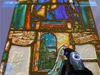
The second problem to watch out for is that if you have a deep, complex bump map, the reflections can be barely noticeable because of all the sharp angles. The window below uses a bump height of 0.01, which is tiny compared to the wall in the Attention To Detail section above, which uses 0.25.
 |
 |
 |
| Window Texture (click to enlarge) |
Bump Map (click to enlarge) |
Bumped Specular Cube Map In-Game (click to enlarge) |
The bump map for this example was easy to create, yet required some forethought into what the end result was trying to achieve. The grayscale of the texture was inverted so as to allow better distinction around the edges (they would otherwise just follow the shading of the texture and it wouldn't stand out at such a low bump height). This also made the black lead around the stained glass the most reflective part of the texture, just as it should be.
The bump map was then subjected to Layer>Colors>Auto>Equalize, which is very useful for bringing out the differences in the shades of gray and thereby increasing the detail level. It was then blurred slightly and Stretch Contrast-ed.
Conclusion
Hopefully I've shown you some different approaches to creating bump maps and inspired you to use whatever means are necessary in order to get the best result. Take a look at the filters and other tools in The GIMP and learn how they work. You'll then be to apply them effectively, when appropriate, to create the best possible bump map for your texture.